Updated 6:02 PM CDT, Mon October 29, 2018
Published Under: Case Studies Website Launches

City State Bank is a community bank headquartered in Norwalk, Iowa. They have 11 locations split between banking, trust & investment and insurance offices in central Iowa.
After listening to the client’s goals and understanding the feedback they received about the website, we focused on a few main issues the new website would need to resolve:
- The need for a modern design and user interface
- More robust content to aid understanding of their products & services
- Make it easy to find the right person to contact
- Show that the client is a comprehensive financial services provider
- Find balance between the different product/service departments
- Drive people toward lead/revenue generating tools within the website
- Combine all of the above to promote an image centered on competency, knowledge and experience
Modern Design and Interface
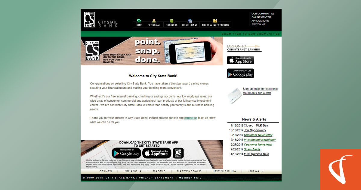
Screenshot of City State Bank's original website.
The previous website development project happened long ago, and the website desperately needed to be brought up to modern design standards and web development practices.
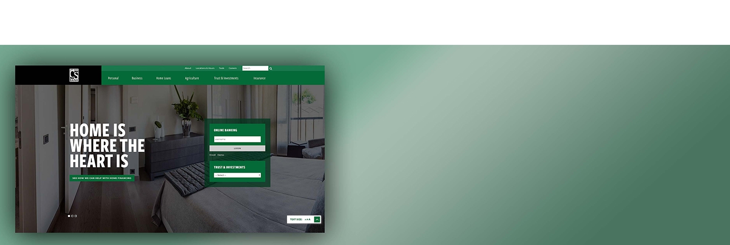
Our UX designers and interface developers provided both in the form of a full-width design, a unique dropdown navigation, parallax scrolling elements and doses of animation and interactivity across the website. The new design and interface gave a much different perspective about the bank: that they valued their online presence and wanted to make it easier to use their website.
Robust Content, Balance, Driving Leads and the “Comprehensive Provider” Concept
Content was in one of three states on the previous website:
- Focused fully on technical features instead of the benefits of how their products & services helped people
- Incomplete; “We offer X-product, see us today.”
- Missing entirely
Fortunately, all of the departments within the bank were engaged in the project, providing a desired list of content, tools and other items they wanted on the website.
After sorting through those that relied on third parties or were out of scope, we came to a sitemap that balanced the needs of each department in an effort to illustrate that the bank, trust & investments and insurance groups could cover most, if not all, of someone’s financial needs.
The content was then written and revised in order to provide:
- A simplified and easier way of understanding each product or service;
- Enough information to help people make a decision on whether to use a product or service; AND
- A call to action to help them take the next step, whether that’s contacting a specific person, following a link or contacting a branch.
The result is content that is more focused on helping visitors through their experience instead of simply listing out product features in a brochure-like fashion.
Finding the Right Person
City State Bank staff described their approach regarding their staff this way in our project kickoff: “Our people are the key.”
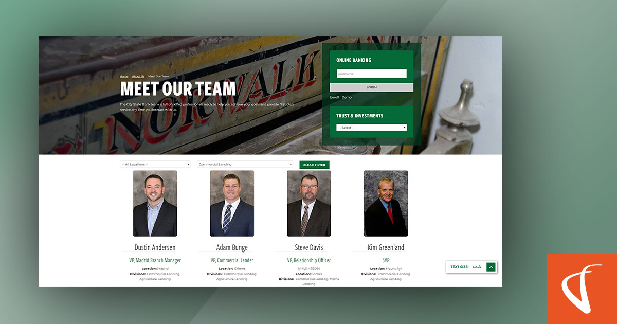
Their team is willing to go to customers where they are in order to have a conversation and make their partnership work. The City State Bank website is an extension of that, as visitors can directly contact staff members in all of the organization’s client-facing verticals: personal/retail banking, business banking, mortgage & home lending, agricultural lending, trust & investments and insurance.
 Screenshot of Meet Our Team page on City State Bank's new website by VGM Forbin.
“It’s not about us, it’s about you.”
By refocusing the design, interface and content on user needs, City State Bank’s website aligns with their outlook that banking is about meeting their customers’ needs, not the bank’s bottom line.
The organization as a whole is committed to this approach, as other conversations have been had about continuing to provide website visitors the tools and content needed to make the best financial decisions for their life.
If you're looking to rediscover what your customers need from your website, reach out and let us help you take your website to new heights!

Comments