Updated 7:05 PM CDT, Wed April 4, 2018
Published Under: Case Studies

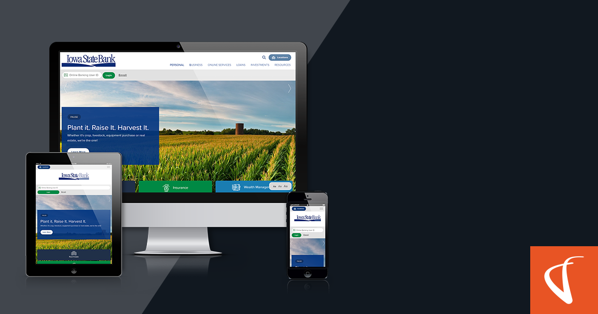
Iowa State Bank approached VGM Forbin because they were looking for a website that is informative at its core, while also creating a simplified visual experience. The community bank was seeking a site that reflected their relational personality and simultaneously provided spot-on customer-sought information.
Take a peek into our process of discovery for creating a website that has Iowa State Bank’s users coming back!
Q: What makes you a community bank?
A: We live, work, and invest in Northwest Iowa.
✔ Create an “About Us” page emphasizing their commitment to the local community.
✔ Establish a personal relationship with the bank by including a heartfelt message from the bank President along with his photo.
✔ Showcase employee dedication by highlighting the quality services they provide.
Q: How do you want users, first-time or returning to feel when they come to your website?
A:Iowa State Bank is a modern, progressive community bank that can offer exceptional convenience, but also a level of service only available from a community bank.
✔ Create a straightforward navigation.
✔ Include familiar images that makes users feel at home: coffee cups, agriculture, and fishing.
✔ Craft content to be informative and informal in nature, humanizing the bank's online personality.
Q: What are your site design goals?
A: We want a site that is easy to use, without a lot of “extra” content that is distracting to user goals.
✔ Style the content to be large and easy to read.
✔ Maintain large buttons with calls to action.
✔ Create information-driven pages, with the most important and sought-after content at the top.
Our design, development and marketing teams strategized on creating a website that was as serviceable as walking into a branch location. It was our pleasure to create a product that meets the needs of Iowa State Bank and their customers.
Discover the Difference
Comments